…or Mouse.. or Pen.. or nose, whatever you like. In WPF this is very easy accomplished, because Drag&Drop is a main UI feature in Windows. Each OS implements this feature slightly different, that’s why there is no such generic solution for all platforms. Microsoft proposes a solution called TouchEffect, which implements a specific Effect for each platform. (https://docs.microsoft.com/de-de/xamarin/xamarin-forms/app-fundamentals/effects/touch-tracking)
But there is still another and quite simple solution, you can use gestures (esp. the PanGesture) for that, with slight limitations.
The PanGesture
The PanGesture is actually a touch based Drag&Drop. You put the finger down on the screen and moved it around until you raise your finger. The PanGesture will always fire it’s event while the finger is moving around and will be quitted with the coordinates (0,0)
The Implementation
The implementation is quite simple, actually there are only a few lines of code:
1. when panning starts: save current Translation of View
2. while panning: set translation to the starting value + panning value
3. when panning finished: reset variable for starting value
Developers are lazy people, we don’t want to copy that implementation on every View. So the trick is, to use an attached property, so we can use it on every View and even bind it to a ViewModel.
The Code
public static class MoveView
{
    #region attached properties: CanMove
    public static readonly BindableProperty CanMoveProperty =
            BindableProperty.CreateAttached("CanMove", typeof(bool), typeof(View), false,
                propertyChanged: OnCanMoveChanged);

    private static void OnCanMoveChanged(BindableObject bindable, object oldValue, object newValue)
    {
        if ((bool)newValue && bindable is View view)
        {
            PanGestureRecognizer pangest = new PanGestureRecognizer();
            pangest.PanUpdated += Pangest_PanUpdated;
            view.GestureRecognizers.Add(pangest);
        }
    }
    public static bool GetCanMove(BindableObject bindable)
    {
        return (bool)bindable.GetValue(CanMoveProperty);
    }

    public static void SetCanMove(BindableObject bindable, bool value)
    {

        bindable.SetValue(CanMoveProperty, value);
    }
    #endregion

    // saves the translation state on start, it's okay to have it static
    // because we can only move one item at a time
    static Point? _translationStart = null;
    private static void Pangest_PanUpdated(object sender, PanUpdatedEventArgs e)
    {
        if (sender is View view)
        {
            if (e.TotalX == 0 && e.TotalY == 0)
            {
                // movement has end, reset
                _translationStart = null;
            }
            else
            {
                if (_translationStart == null)
                {
                    (view.Parent as Layout)?.RaiseChild(view);
                    _translationStart = new Point(view.TranslationX, view.TranslationY);
                }
                view.TranslationX = e.TotalX + _translationStart.Value.X;
                view.TranslationY = e.TotalY + _translationStart.Value.Y;
            }

        }
    }
}
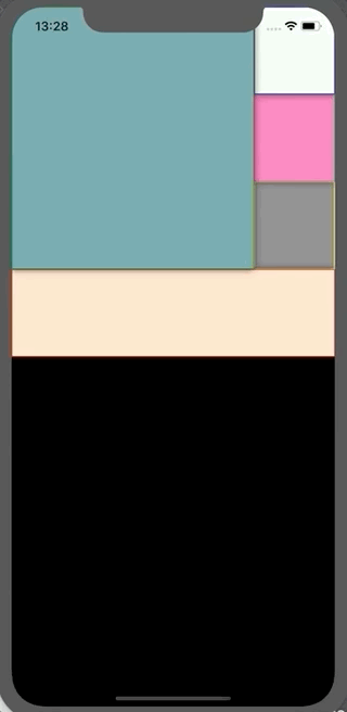
Usage
 <Frame BorderColor="Red" BackgroundColor="Bisque"
                   dashboard:MoveView.CanMove="True"
                   HeightRequest="100" VerticalOptions="Center"
                 />
Limitations
– only when the parent is a layout, it will raise the View that is moved to the topmost position (only in respect to the parent, not overall)
– you can simply move the View outside of its parent, but then you will not be able to move it back in
Please feel free to use the code and change it as you like. If you find bugs, you may fix them. I would also be happy if you leave me some notes.


 Tom's Tech Blog